LFT Etica – NRK logo

08. november 2018

NRK med spesialtilpassede fonter. Viser denne artikkelen med våre gode sammarbeidspartnerer Typetogether og NRK.

NRK LOGOTYPE

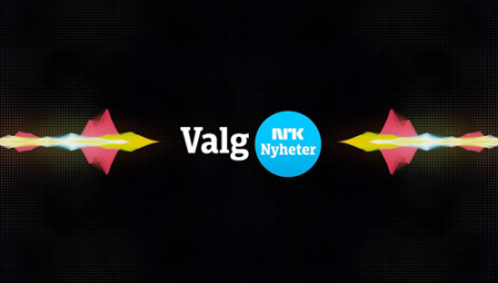
The public Norwegian TV station, NRK, commissioned TypeTogether to create a tailored typeface for their new visual identity. As part of the same commission, NRK asked TypeTogether to refine the new circle logo using the tailored typeface in conjunction with the established NRK lettering for the two channels of NRK Nyheter (News) and NRK Sport.

2014_NRK_02.png

DEVELOPMENT

For a wide range of reasons, installing a font and typing the company name does not make a logo. When designing a custom font, letters are created in such a way that they can fit before and after any other letter, ensuring consistency and legibility in unknown letter combinations. However, when creating a logotype, the sequence of letters is known so the shapes must be adjusted to appear harmonious and appealing.

Another thing to keep in mind is the necessity for different versions of the logo to fit a range of technical requirements, given that it will be printed on billboards and business cards, by offset and laser printers, and also reproduced in both high and low resolution screens.

NRK01.png

NRK developed a system with three levels of logo hierarchy, meaning that special refinements had to be made for each. First, the correct weight and tone for the words Nyheter and Sporthad to be defined for when they were set next to the NRK symbol on one line. At the same time, small changes to the letterforms were made to ensure a balanced wordmark. Such details include straightening the terminal of the ‘r’ in Nyheter instead of keeping the angle that appears in the typeface, and, in Sport, cutting the left side of the crossbar on ‘t’ at the same angle as the ‘r’ to visually harmonise them.

The secondary logo was more tricky and underwent several rounds of feedback and alterations. One of the main problems was to get the balance between Nyheter/Sport and NRK right. Simultaneously, balancing between the two circled logos, given the different word lengths, was an additional challenge. The two words couldn’t be the same size but had to appear similar in weight. Therefore much of the stem thickness and letter spacing had to be fine-tuned.

As seen below, the completed branding is worth the scrutiny given at each step, and this effort is what it takes to ensure the mark appears as it should in each format, at all sizes, and either seen together or by itself.

NRK02.png

Focused adjustments of letters in the logotype compared to the original design of the typeface.

NRK09.png

Comparison of the previous logotype and the updated version based on the tailored typeface.

2014_NRK_052.pngFeedback notes from client.

NRK10.png


LFT Etica

07. november 2018

NRK med spesialtilpassede fonter. Viser denne artikkelen med våre gode sammarbeidspartnerer Typetogether og NRK.


The Norwegian public TV station, NRK, commissioned TypeTogether to create a tailored typeface for their new branding based on Leftloft’s LFT Etica. Since LFT Etica had already been established in NRK’s identity program, TypeTogether collaborated with the original designers at Leftloft to accomplish this goal, eventually creating the wide-ranging LFT Etica Sheriff as a result.

NRK07

POINT OF ORIGIN

NRK wanted to strengthen and improve their brand position. So in 2010 the internal design team at NRK collaborated with the Scandinavian Design Group (SDG) in developing a new visual identity based on NRK’s original vision and values: open, courageous, and trustworthy. This resulted in the circle divided by three lines, strong modern colours, and a contemporary typographic palette with LFT Etica. Over the next few years the typeface gained room within the NRK mother brand and in 2013/14 the need for a complimentary slab typeface arose.

This sturdy slab version of LFT Etica, was to be customised to serve NRK’s identity needs mainly for the News (Nyheter) and Sport channels on the web and TV, and as a broadcasting font. Additionally, the new slab was to be used in the logotype for Nyheter and Sport. Read more about the development here.

One of the initial concerns was the rather generous width of the LFT Etica fonts, so it was decided to test a condensed version which had already been in the beta development stage for retail. After some discussion with the internal design team at NRK and consulting SDG, the chosen starting point fell to LFT Etica Condensed Semi-Bold and LFT Etica Condensed Book.

NRK03

2014_NRK_24

NRK’s corporate identity using LFT Etica.


DEVELOPMENT

The first stage was comprised of three design suggestions within the slab theme. The words Nyheter, Urix, and Ytring, important to NRK, together with a small set of key letters were developed by the original designers of LFT Etica at Leftloft. Given that the role of the slab was complimentary to the original sans, the general stem thickness and vertical proportions were therefore maintained. The three directions differentiate themselves by finer details such as serif construction, terminal shape, and alternate forms of ‘a’ and ‘g’.

All design teams felt that option 3 proposed the best solution for the new brand, appearing more open and friendly than the other two ideas.

NRK04

Comparison of the three design directions.

NRK05

Design option 1 details.NRK06

Design option 2 details.

NRK08

Design option 3 details — the direction chosen by the teams.

Credits
Lead design
Leftloft

Art direction
NRK design team
Veronika Burian & José Scaglione

Supportive design
Octavio Pardo

Engineering
Sonja Stange